Assisting with the Transition of promising NWP Techniques from research to Operations
The ability to consolidate and integrate numerous verification results that are increasingly differentiated in intent and type largely depends on the effectiveness of graphical displays. In response to these needs, several new kinds of displays have recently been added to the DTC and MET arsenal, or are in process of development and assessment at the DTC.
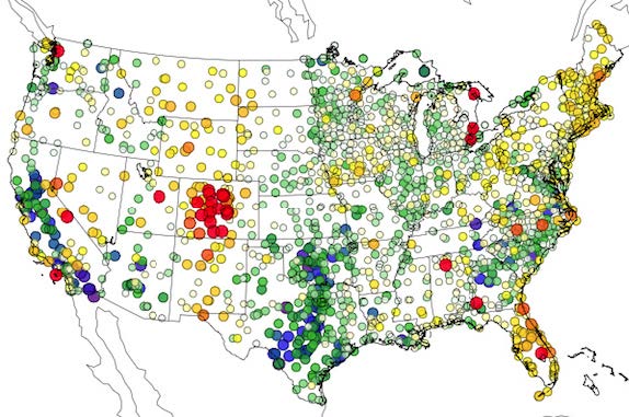
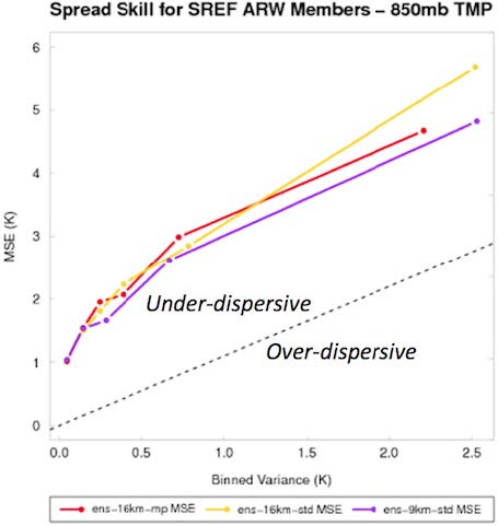
An example is the regional display of verification scores in the figure above, where results from relatively long verification periods at point locations are shown (in this case, dewpoint temperature bias at surface observation sites). Although time resolution is sacrificed, these plots represent an important way to assess topographic, data density, and other geographic effects on model accuracy. In the first figure, for instance, the cluster of red symbols (portraying too-high dewpoints) in the mountains of Colorado, and along the east coast offer clues useful for assessing model inaccuracies. The opposite tendency (low-biased dewpoints, or toodry forecasts) are pronounced over Texas and Oklahoma, and in the Central Valley of California. The figure below is an example of new utilities used by the Ensemble Task to compute and display ensemble-relevant verification results. In this case, it is one way to present the spread-skill relationship, an important characteristic of ensemble systems. As is commonly seen, these particular CONUS-based ensemble members display an under-dispersive relationship; the struggle to create ensemble systems that accurately represent the natural variability is a difficult one still.
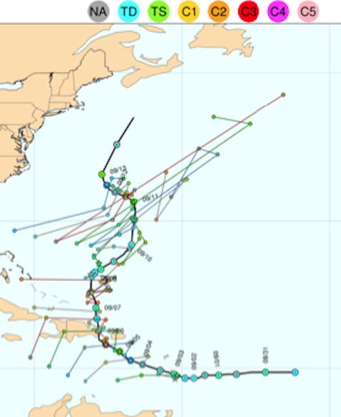
Among ongoing and future product directions are display options for time series evaluation of forecast consistency, in particular for “revision series” of hurricane track locations (figure below). The objective of this kind of graphic is to examine the consistency of a model’s track prediction with its own prior forecasts at the same location and time. For many users, this consistency in forecasts through time is a desirable quality; if updating forecasts change much or often, a user may believe they are of low quality, possibly even random. For instance, in the figure, the model shows consistent updates in the Caribbean, and inconsistent (zigzagging) ones as the storm moves northward. These latter forecasts of hurricane location might thus be considered less reliable.